Portfolio Website
A modern, responsive personal portfolio built with vanilla HTML, Tailwind CSS, and JavaScript
Project Overview
Purpose
This portfolio website serves as a digital resume and showcase of my professional experience as a Full-Stack Software Engineer. The goal was to create a clean, modern, and accessible platform that effectively communicates my skills, experience, and projects while demonstrating my front-end development capabilities.
Challenge
Create a portfolio website that is fast, accessible, and visually appealing without relying on heavy frameworks or build processes. The site needed to be easily maintainable, SEO-friendly, and provide an excellent user experience across all devices and themes.
Solution
Built a single-page application using semantic HTML5, Tailwind CSS Browser CDN for rapid styling, and vanilla JavaScript for interactivity. Implemented a custom light/dark theme toggle with localStorage persistence, mobile-first responsive design, and SEO optimizations including meta tags, robots.txt, and sitemap.xml.
Screenshots

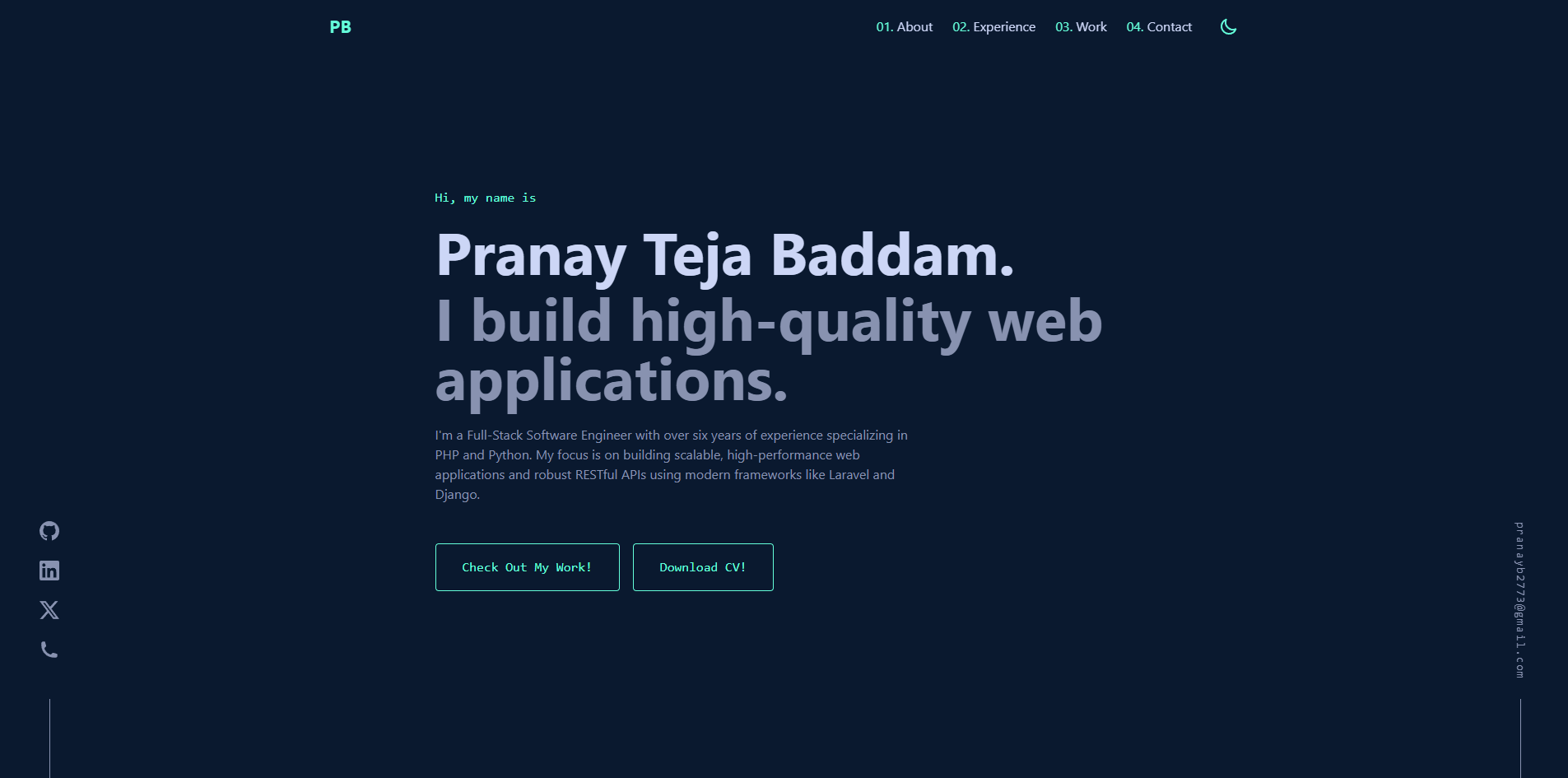
Hero Section with Introduction

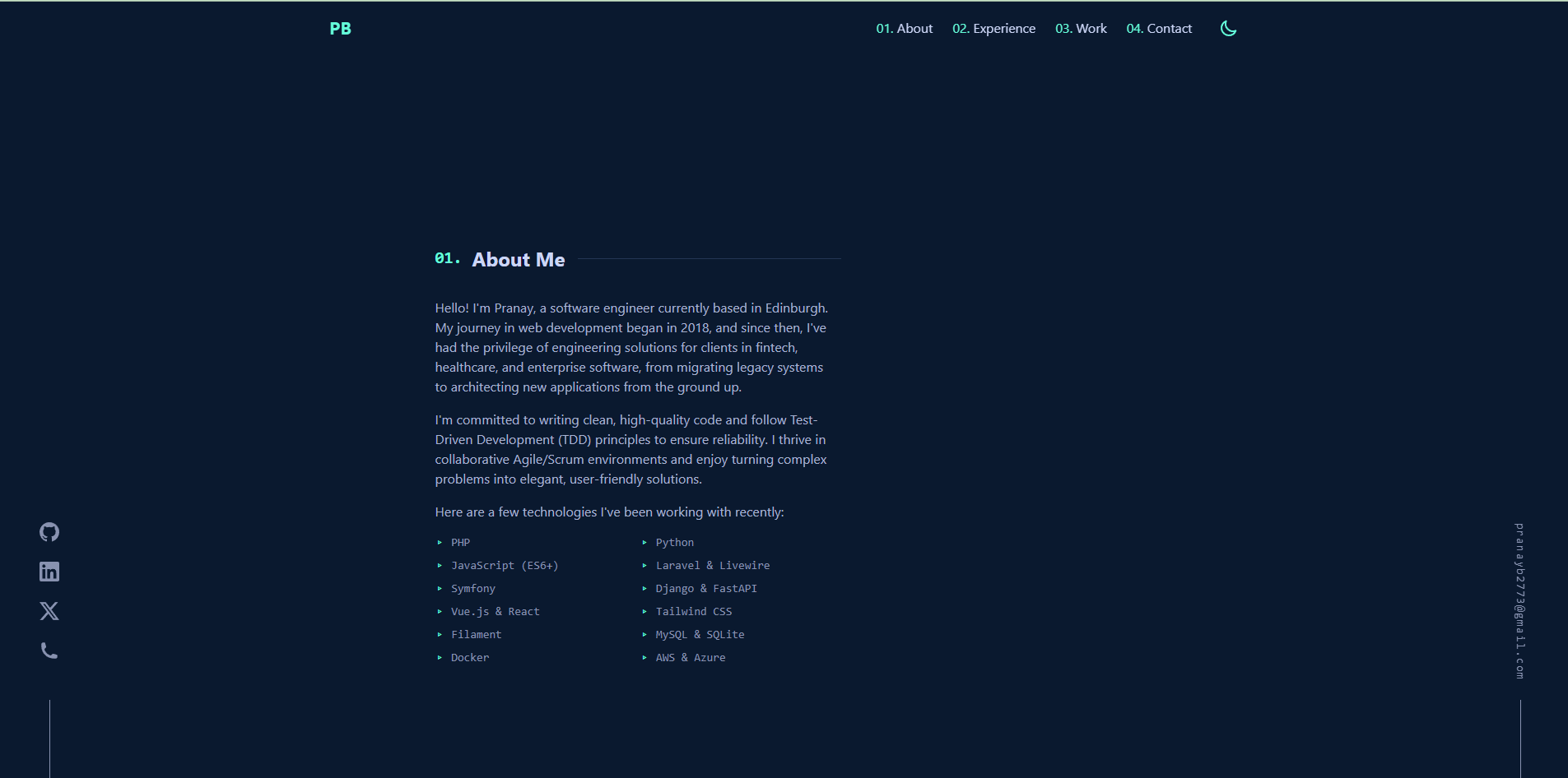
About Section with Skills

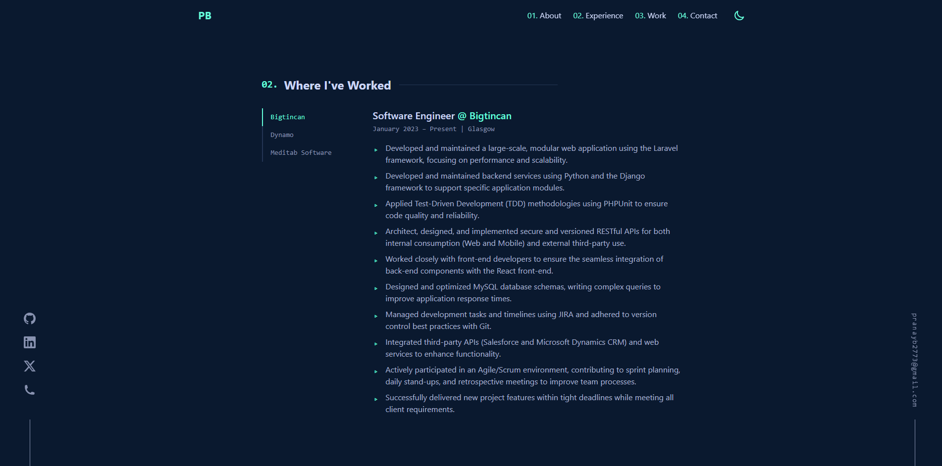
Work Experience with Tab Navigation

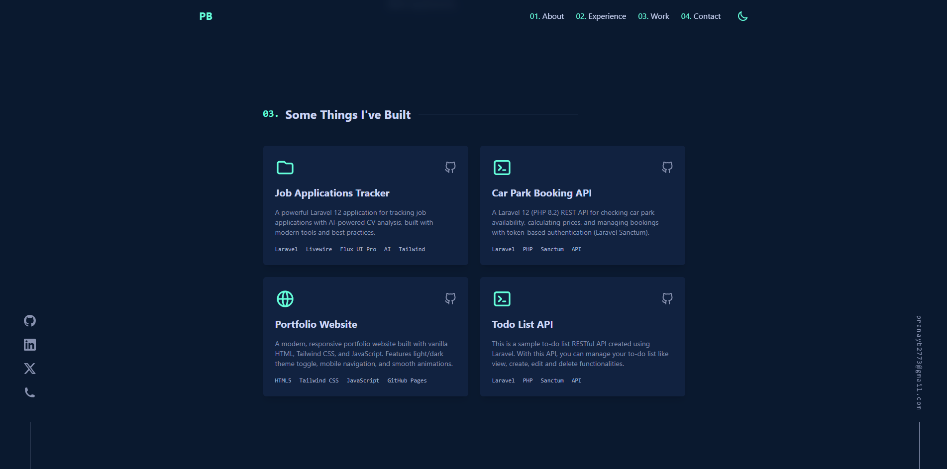
Featured Projects Showcase
Key Features
Light/Dark Theme Toggle
Custom theme switcher with smooth transitions. User preference persists across sessions using localStorage. Includes carefully crafted color palettes for both themes with optimized contrast ratios.
Mobile-First Design
Fully responsive layout optimized for all screen sizes. Features a hamburger menu for mobile navigation with smooth slide-in animation and body scroll prevention when menu is open.
SEO Optimized
Comprehensive meta tags including Open Graph and Twitter Cards. Includes robots.txt for search engine instructions and sitemap.xml for better indexing. Semantic HTML5 markup for improved accessibility and SEO.
Performance Optimized
Zero build process with CDN-based Tailwind CSS for fast loading. Minimal JavaScript for core functionality. Smooth CSS transitions and animations without performance overhead. Perfect for static hosting on GitHub Pages.
Interactive Components
Tab-based work experience navigation for easy browsing. Smooth scroll-to-section navigation. Hover effects and animations on project cards. Downloadable PDF resume with clear call-to-action buttons.
Accessible Design
ARIA labels for better screen reader support. Keyboard navigation friendly. High contrast color schemes in both themes. Semantic HTML structure for improved accessibility and better user experience.
Technology Stack
Frontend
-
▹
HTML5
Semantic markup for better SEO and accessibility
-
▹
Tailwind CSS (Browser CDN v4)
Utility-first CSS framework for rapid styling without build process
-
▹
JavaScript (ES6+)
Vanilla JavaScript for theme toggle, mobile menu, and tab navigation
-
▹
Google Fonts
Inter font family for modern typography
Development & Deployment
-
▹
Git
Version control and source code management
-
▹
GitHub Pages
Static site hosting with automatic deployment from main branch
-
▹
Custom Domain
Configured with CNAME for professional domain (pranaybaddam.site)
SEO & Performance
-
▹
Meta Tags
Open Graph, Twitter Cards, and standard SEO meta tags
-
▹
robots.txt & sitemap.xml
Search engine optimization files for better indexing
Project Structure
.
├── index.html # Main portfolio page (HTML + Tailwind + JS)
├── pages/ # Project detail pages
│ ├── portfolio-project.html # This case study page
│ ├── carpark-booking-api.html # Car Park Booking API project
│ ├── todo-list-api.html # Todo List API project
│ └── job-tracker.html # Job Application Tracker project
├── assets/ # Static assets
│ ├── images/ # Images and media files
│ │ ├── Home.png # Screenshot - Homepage
│ │ ├── About.png # Screenshot - About section
│ │ ├── Experience.png # Screenshot - Experience section
│ │ ├── Projects.png # Screenshot - Projects section
│ │ ├── pb.ico # Favicon
│ │ └── pranay_baddam_software_engineer.pdf # Downloadable CV/Resume
│ ├── css/ # Stylesheets
│ │ └── styles.css # Custom CSS styles
│ └── js/ # JavaScript files
│ ├── theme.js # Theme toggle functionality
│ └── main.js # Main JavaScript file
├── robots.txt # SEO - Search engine instructions
├── sitemap.xml # SEO - Site map for search engines
├── .gitignore # Git ignore rules
├── CNAME # Custom domain configuration
└── README.md # Project documentation
Technical Implementation
1. Theme Toggle System
Implemented a custom theme switcher that toggles between light and dark modes. The system uses CSS custom properties (CSS variables) to define color schemes and JavaScript to manage theme state.
- ▹ CSS custom properties for dynamic color switching
- ▹ localStorage API for persisting user preference
- ▹ Smooth 0.3s transitions for theme changes
- ▹ Synchronized toggle buttons for desktop and mobile
2. Responsive Navigation
Created a mobile-first navigation system with a hamburger menu for smaller screens and a traditional horizontal menu for desktop.
- ▹ Breakpoint-based visibility with Tailwind's responsive classes
- ▹ Full-screen mobile menu overlay with slide-in animation
- ▹ Body scroll prevention when mobile menu is open
- ▹ Smooth scroll to sections with proper z-index management
3. Interactive Experience Tabs
Built a tab-based interface for the work experience section, allowing users to switch between different companies easily.
- ▹ Event delegation for efficient tab switching
- ▹ Dynamic content visibility with show/hide logic
- ▹ Active state styling with border accent colors
- ▹ Responsive layout (vertical on desktop, horizontal on mobile)
4. Performance Optimization
Focused on delivering fast loading times and smooth performance without compromising design quality.
- ▹ Zero build process - direct browser execution
- ▹ CDN-delivered Tailwind CSS for fast loading
- ▹ Minimal JavaScript (under 100 lines)
- ▹ CSS transitions instead of JavaScript animations
- ▹ Preconnect hints for Google Fonts
Lessons Learned
-
▹
Simplicity is powerful: Modern web development doesn't always require complex frameworks. Vanilla JavaScript and Tailwind CSS can deliver professional results with better performance.
-
▹
Mobile-first approach works: Starting with mobile design constraints leads to better decision-making and cleaner code for all screen sizes.
-
▹
User preferences matter: Implementing theme persistence with localStorage significantly improves user experience by respecting their choice.
-
▹
SEO from the start: Building in SEO optimizations from the beginning (semantic HTML, meta tags, sitemap) is easier than adding them later.
-
▹
Accessibility is essential: Using ARIA labels, semantic HTML, and proper contrast ratios makes the site usable for everyone and improves overall quality.
Future Improvements
Blog Integration
Add a blog section to share technical articles and tutorials, helping to increase organic traffic and demonstrate expertise.
Contact Form
Implement a working contact form with backend integration (possibly using Netlify Forms or similar) to make it easier for potential employers to reach out.
Analytics Integration
Add Google Analytics or privacy-focused alternatives like Plausible to track visitor behavior and optimize content.
Project Filtering
Add filter buttons to the projects section to allow visitors to filter by technology stack (Laravel, Python, React, etc.).